
The Challenge
The charity had lost access to the assets of their website, so needed a new website and a new brand. While I had contributed to rebrandings, I was never in charge of one. This project gave me the opportunity of owning the process from start to end.
Research and Analysis
To get started I asked John, the CEO, a lot of questions about the charity. The whats the and the whys of the foundation. I got access to the original branding and found out:
Yellow as primary colour
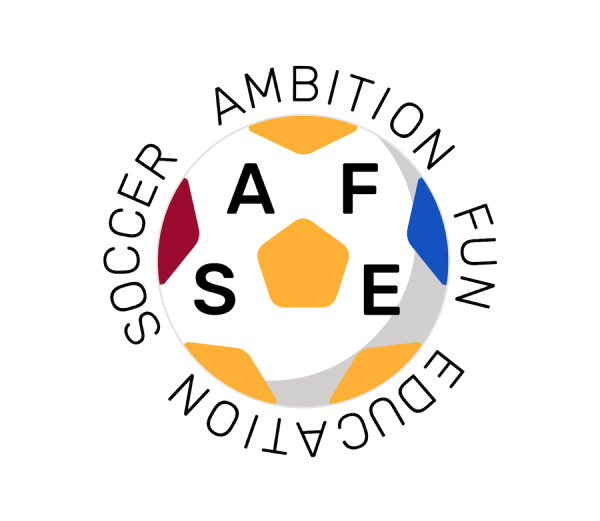
The main logo had Yellow as a primary colour, a colour that is quite hard to work with for contrast reasons.
Children programmes
The charity organises all sorts of programmes and events for children across different South London areas. Those events need to be attractive and available for bookings.
I decided I would create a brand guideline, with logo, colour and typography guidelines to deliver to the Foundation and help me get started on the web development part of the project.
Design and Colour
I worked on the logo first. I started using the original logo, but then evolved it further to make it more modern and playful. More fit for the audience that I thought would engage with the Foundation.

The primary colours were picked after looking at SAFE Foundation official sportswear. There were burgundy and blue t-shirts that were used throughout the years.

Typography
After I was happy with the logo, I created typography guidelines. I opted for Rubik, because it offered great redability and had all those elements of playfulness and roundness that I was looking for in a typeface.

Finalise
I went ahead and developed the foundation’s website using HUGO and deployed it on CloudCannon, to make it easier for the foundation personnel to edit the content of the file through a CMS. It is currently available at HUGO