The Challenge
I use both the mobile and web app of Good reads, but I find it very busy and it always takes me some time to pick my next book to read. I started by asking my Goodreads friends, what was the primary reason for them to visit Goodreads and ‘finding my next read’ was top of the list. This was an informal research.
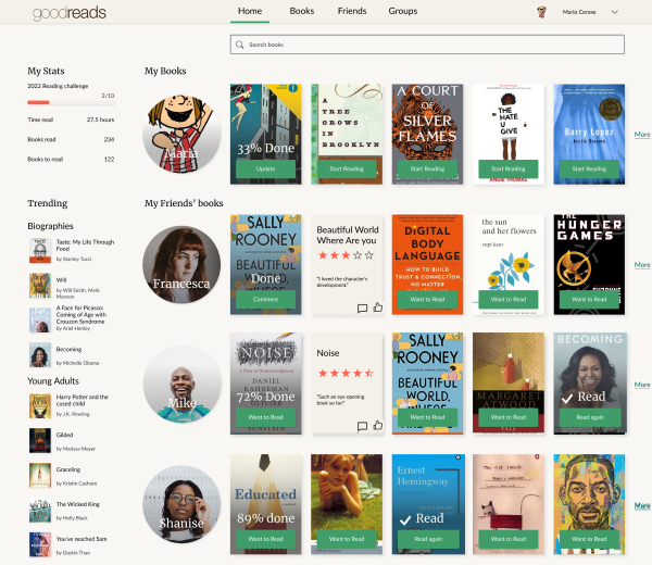
Design
I started by taking note of the branding of the site, the colours, typography, content spacing and decided to focus on the Home page.

In particular I wanted to help the choice of the next read by highlighting the books in the list of your network friends. I combined this with a wish to make the whole app look more modern, more like an app than a feed.

I took a component based approach for the design, which will help with the creation of future pages.
Validate
I shared early versions of my designs to my friends, users of goodreads, and got their feedback.
Spacing
The books on the right were not obviously connected to the users. The spacing and placement did not shout ‘it’s a row’.
As a result I have tightened the sections to metter use the negative space between the side bar of global updates and the main section containing friends’ trends.