
The Challenge
Airline apps are quite complex applications. Users’ goodwill can easily diminish, as there are some very intensive tasks, where the user is expected to provide loads of data, in a very short amount of time. All this, with limited screen space and guidance. I had created sign-up and cancellation flows before, as a PM, but in this case, I was alone in creating all flows.
Research and Analysis
I ran usability studies and interviews, to get an understanding of context, goals and behaviours of flyers. With that information I designed user journey map and affinity diagram. From the start, price and time emerged as the most important factors of decision making.
These were the top insights:
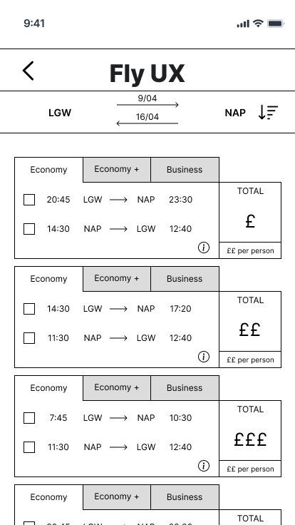
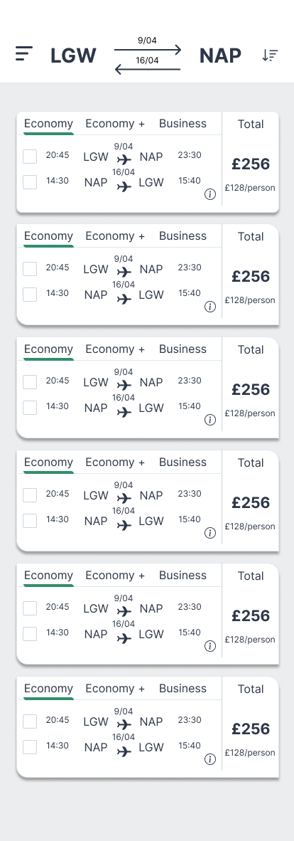
Price confusion
Switching between ‘Price per person’ and ‘Total price’ was often not clear, and created some serious disappointments in users that felt cheated or tricked by the way the information on price was displayed.
Direct flights vs Stops
In some cases the users only found out very late that the flights they ended up selecting, included a layover stop that lasted several hours. This was due to the lack of UX/UI emphasis on such a key piece of information.
Passenger info Pain
The most painful and time consuming task was the completion of passenger information. The apps that performed the best were those that made this step as simple as possible, with prefilled form fields and minimal inputs required.

User Journey

Design
The first step was to create a clear user flow, that would be comprehensive of happy path and unhappy path. The key challenge was not to focus on screens and controls, but the flow of the user, in, out and around their primary goal.

After designing the flow, I concentrated on the key interactions, such as passenger info input and date selection. Finally I moved to wireframes and prototyping with Figma.
Validate
I tested the prototype with a set of users and gained these key insights that led me to make some changes.
Navigation was unclear
The user did not know how to go back to the previous screens. So I had to make the navigation controls more evident.
Over eager validation
I was providing too much inline validation, meaning that the prototype was giving too much feedback, too early.
Finalise
All the feedback went into the final prototype where I tried to simplify the flow and make it even more obvious. I then worked to translate the prototype of the search result into a higher fidelity page that would be both fun and simple to read.