The Challenge
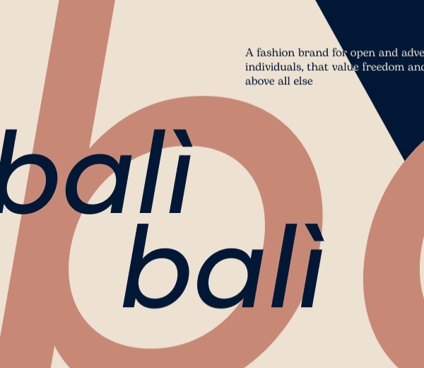
I started to look for words that would inspire me, and found ‘balì balì’. balì bali means ’to wander’. It’s a word from southern italian dialect often used to describe leisure walking and this inspired me to make it the subject of a luxury fashion brand.
Design
I started by exploring typography. I wanted the brand to communicate dynamism and modernity, so I narrowed it to geometric typefaces. I settled on Filson Pro, used in italic to give motion to the logomark. For the body text I opted for a more relaxed, serif font to give a little romanticism to the entire brand identity.

The logomark plays on the rule of thirds, giving a sens of dynamism, legs moving forward. Colours and photography are inspired by mediterranean architecture and culture.
![]()
Finally I put it all together in a simple set of brand guidelines that instruct and show how to use the brand in digital and print. Click on the upper side bar to download pdf guidelines.
