The Challenge
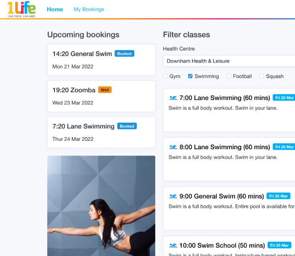
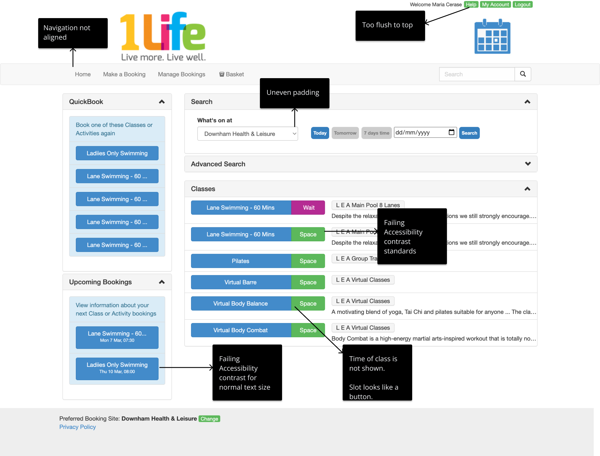
I wanted to understand why the experience was designed like this. Basically, to book any gym or swimming slot, you first filtered or searched, and then you could click. Each result was a slot, with a given time, but the time was not displayed. So, to find out which time the slot referred to, you first had to click and go into the slot… to only find out, it was not the slot you want. This creates a lot of back and forth and back and forth attempts. Something that is actually an ok experience on mobile. On this web app, there are also oddities with the interface. Here is just a quick overview of the areas I thought could be improved.
Process
I started by observing the design and the current user flow. This made me understand the reason behind this design: it skips the need of aagination and doesn’t require a lot of flitering in the first place. This approach is quite an oldfashioned and doesn’t make use of good design practices. There are smart defaults that can be used to make this whole experiece smoother. I decided this experience could be turned around in a very simple way: using bootstrap and a similar design to the existing one. A radical change is not needed when you want to improve useability.
Design
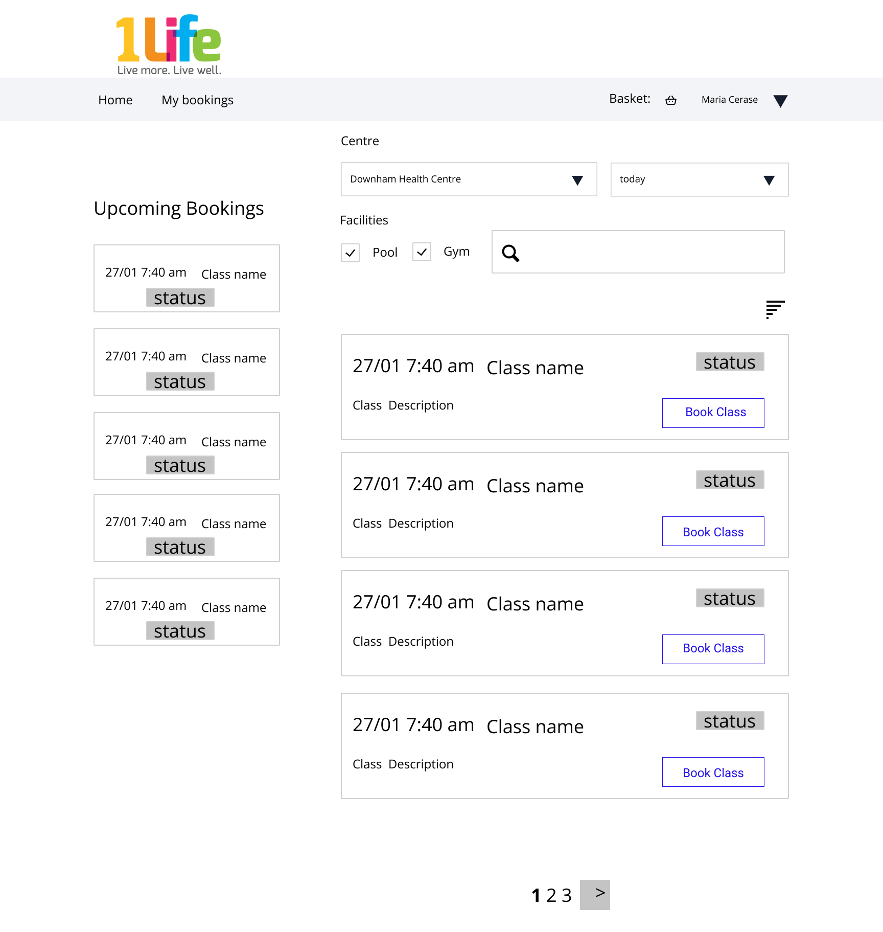
In this very simple wireframe, the information hierarchy has been deepened. There are additional filters that allow the user to filter classes by facility. Facilities are dependent on the Health Centre selection, and the Health Center can be defaulted to the one that is either geographically closest, or if the user is logged in, to the preferred one. The classes are expressed as cards, where time of the class is very prominent, and the call to action is also clear. In the current design, the whole concept of ‘Waitlist’ is quite pointless, as it rarely happens that you go from waitlist to booking.
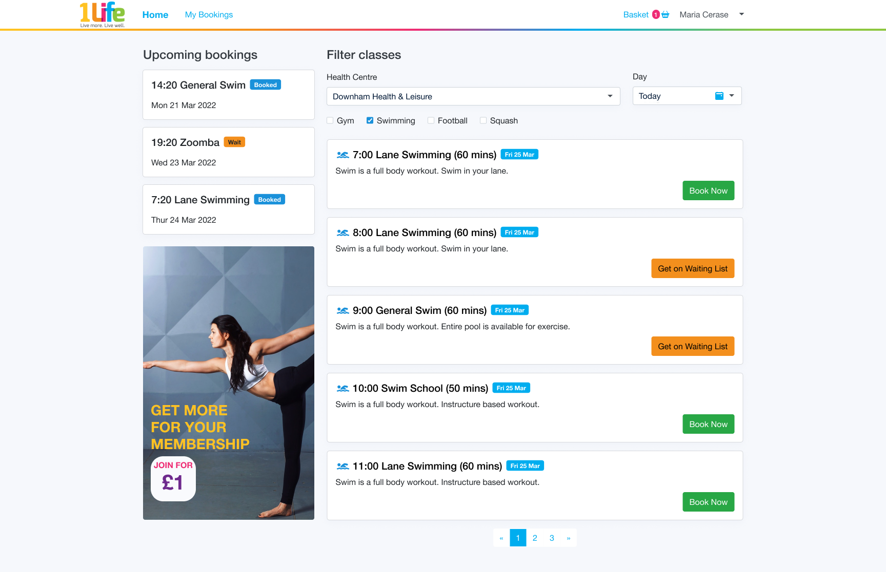
This is the final page. Simple, clean, functional. The brand colours are translated in the call to actions, without making them overwhelming but and still meaningful. A subtle nod to the brand is also visible in a gradient line underneath the navigation. Search bars are removed to make the experience simpler. Let me know what you think.